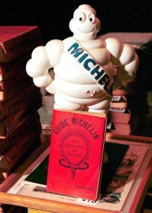
What’s the first name that springs to mind when you think of a gastronomic guidebook? The Michelin guide of course!
But did you know that the Michelin guide began as a 19th C tire vendor in the Auvergne-Rhône-Alpes region of France? Naturally, the big question was how to elbow people towards buying more tires at a time when cars themselves were a rarity. The canny founder-brothers André and Édouard found a way. They egged car owners to wheel about the country by distributing a little guide with maps and routes, then began dotting it with restaurant reviews. Thus was born the Michelin guide.
Today, of course the guide sits at the top of the culinary hierarchy. Anonymous inspectors hopscotch across Europe, Australia and North America, scrutinizing restaurant dishes (and service and décor), and flinging a star or two or three at those they deem deserving. It has crowned obscure European gastronomy such as ‘fire cooking’ at Stockholm’s Ekstedt restaurant and culinary invention such as the much-vaunted molecular gastronomy at Spain’s el Bulli.
And yet, for all its prestige, the guide remains intensely parochial.
in.pinterest.com
It was only an entire century after its birth did the guide deem Japan as a worthy beneficiary of its precious star. In its wake followed the Thailand, China, Singapore, Vietnam, Taiwan, the Philippines, South Korea, UAE, and Macau guides. But what of Africa, an entire continent written out of this narrative? And what of South Asia?
Is it because these are countries with no viable market for Michelin’s tires — capitalism after all, always lurks beneath the surface. Is it that Michelin’s inspectors simply don’t know how to evaluate South Asian cuisine? But after all, the guide has bestowed stars to Indian restaurants in the USA, the UK and Dubai, hurtling those chefs to stardom. Trèsind Studio in Dubai, Semma in New York City, Gaggan in Bangkok, and Benares in London all hold Michelin stars (amongst multiple others).
“
Indian restaurants are no longer leashed by the constraints of tradition, offering food and drinks that are restlessly cosmopolitan, cleaving to familiar Indian ingredients such as kokum fruit and green mango, while inflecting them with a touch of international whimsy.
”
Meanwhile, back in India, a world-class fine dining scene is now sprouting. Indian restaurants are no longer leashed by the constraints of tradition, offering food and drinks that are restlessly cosmopolitan, cleaving to familiar Indian ingredients such as kokum fruit and green mango, while inflecting them with a touch of international whimsy.
India comes with its own set of deeply-beloved food guides; the Times Food Guide has stewarded diners to their favorite eateries for decades. The World’s Top Restaurants (Asia Edition) now lists multiple Indian restaurants. The Singapore-based Miele Guide was Asia’s very first restaurant guide, with thousands of people voting for their favorites, rather than relying on the caprice of anonymous Western judges — alas, it sank without a trace. The internet has fueled the rise of an entire stable of food content – bloggers, content creators, influencers all prowling the streets to find the next ‘hidden gem’, whether it is that tiny coastal seafood restaurant or the vendor selling succulent seekh kebabs in a bustling bazaar.
And so perhaps the uncomfortable question is not why the Michelin won’t wend its way to India, but why we even care. Do we simply want approval from the West, no matter how flawed or incomplete the arbiter?
For many chefs, a Michelin star remains a lifelong goal, and there is nothing wrong with that. Perhaps it behooves us to remember though that it is just one measure of excellence, not the only measure. After all, when a system that styles itself as the global standard for culinary excellence has left out chunks of the global South, it risks becoming a rather good guide to a small part of the world. It’s a statement about whose food is considered worth the journey.
At first glance, there’s nothing remarkable about the matchboxes you can find in India today. Most are faded yellow, with names like Ship, Cycle, or Homelite stamped on them in bold, blocky type. They’re everywhere — in kitchen drawers, corner shops, street stalls. Functional but forgettable.
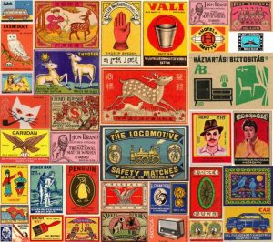
Today, we might not realize it, but there once was a time when matchboxes were the tiniest canvases of art. Packed with personality, their art featured everything from roaring tigers to glamorous film stars, from gods and goddesses, to tractors and tea kettles. Some labels carried political messages, others leaned into pop culture, and many simply leaned on oddball charm to stand out on crowded paan-shop shelves.
Long before India began producing its own matchboxes, we brought them in from faraway places — Sweden, Austria, Czechoslovakia. These imports weren’t just practical; they were works of art, but their aesthetic, like their clientele, was European.
This changed in 1895, when Kolkata and Tamil Nadu began to manufacture homegrown versions. And once these Indian factories took over matchbox production, something interesting happened: the designs became louder, cheekier, and unmistakably Indian — with tractors, temple bells, tigers, film stars and even courtesans, crowding the covers.
Vintage Indian matchboxes told a vivid tale of Indian history and culture / in.pinterest.com
“Some portraits often showed Maharajas on horseback or their official portraits and because of the attention generated by these images, the rulers of states like Jamnagar, Bhavnagar and Cochin reproduced their own customized versions of the matchboxes for personal use,” says Ramya Ramamurthy, author of Branded in History. “The royals of the time were like the influencers of their era – they were emulated for their style, their images sold products and their matchboxes became collectibles.”
But the designs weren’t simply decorative in nature; in fact, they told the tale of their times. For instance, the boxes born during the Freedom struggle told a most interesting story.
“The factories that could get away with making more overtly political matchbox covers featured Bhagat Singh, Mahatma Gandhi, Subhash Chandra Bose or Sarojini Naidu,” says Ramamurthy. “In fact, Gandhi became a whole sub-genre of matchboxes – featuring his wife Kasturba, his ashram in Sabarmati, his famous Gandhi cap and even a brand of matches in his name. The spinning wheel or charkha was another prominent theme in matchboxes. The map of the emerging India freeing itself from the shackles of colonialism was another important theme – the personification of this as Bharatmata or Hindmata – reclining on an elephant, tiger or a similar Indian animal was seen as a common trend.”
“
Today, we might not realize it, but there once was a time when matchboxes were the tiniest canvases of art. Packed with personality, their art featured everything from roaring tigers to glamorous film stars, from gods and goddesses, to tractors and tea kettles.
”
Later, during the agricultural Green Revolution, tractor and farmer imagery abounded. In the 1950s, Bollywood stars began to appear. What began as everyday ephemera became an archive of shifting styles, politics, and pop-cultural moments – in short, the rhythms of daily life. “This is eventually what made phillumeny or the collection of all things related to matches and matchboxes so interesting because it was a record of the companies of the era, an advertising and design journal as well as a record of the impressionable iconography of the time,” explains Ramamurthy.
At one point, you could spot everything from Ganesha to Michael Jackson — symbols of luck, fame, or aspiration. The artwork was also often recycled: a tiger drawn for one brand could easily show up on another, with a new name slapped on top. It was less about copyright, more about circulation.
Alas, today, many of those wild, colorful designs have given way to QR codes and cleaner packaging. So what happened?
“
You’ll find matchbox labels being repurposed into coasters, art prints, even saree borders. On Instagram, collectors are scanning and trading old matchbox labels like rare baseball cards.
”
Part of the shift is economic. As large-scale manufacturers replaced cottage industries, the focus moved to mass production, uniformity, and cost-cutting. A single printer might now churn out hundreds of thousands of identical boxes, designed more for efficiency than flair. Matchbox production itself has declined somewhat; beedi and cigarette users were amongst the highest users in contemporary India and their numbers have nosedived.
The other part is cultural. Visual storytelling has migrated online, to Instagram and YouTube thumbnails. Branding, even at the paan-shop level, has become slicker, more global. Logos are cleaner, colours more muted, and everything’s ready to be scanned, posted, or shared.
And yet, a love for these old designs persists. You’ll find matchbox labels being repurposed into coasters, art prints, even saree borders. On Instagram, collectors are scanning and trading old matchbox labels like rare baseball cards. ArtonaBox, Shreya Katuri’s Instagram page, documents matchboxes from around the world. Cafés in Mumbai and Delhi display framed collages of vintage labels. Artists are reprinting old designs onto notebooks and tote bags.
They are also sparking other conversations. Maachis Art is reviving these tiny canvases into beautiful collectibles (there are T-shirts and postcards too); the viral sneaker brand Comet created a vibrant matchbox-inspired shoe called Maachis; the artist Harshit Agrawal, together with Google Arts & Culture and Tasveer Ghar, has created an interactive matchbox game. At The Maachis Project, Aakansha Kukreja and Aakash Doshi are repurposing old covers into graphic art. In a culture tired of minimalism and slick branding, these little boxes feel refreshing — chaotic, charming, and definitely unpolished.
It’s not just in India. In Japan, there’s a niche but devoted community of match label collectors. In Scandinavia, an entire museum is dedicated to preserving these tiny designs. Across the world, there’s a growing appetite for affordable, tactile nostalgia — small objects that carry weight, history, and memory. They’ve gone from mass object to aesthetic artifact — a reminder that even the most disposable things can hold stories, humour, and history.
Lately, our Instagram feeds have started to resemble Bollywood film sets. Friends in lehengas spinning under disco balls, strangers in sherwanis swinging their hips to Desi Girl, Negronis everywhere, and the unmistakable glow of professional lighting bouncing off turmeric-yellow backdrops.
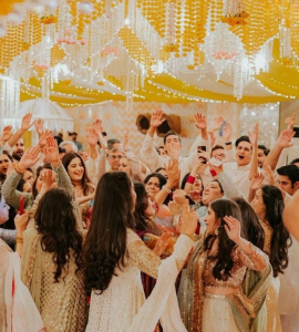
From New York City to Mumbai, London to Dubai, and even in Indian metros like Bangalore, Pune, and Hyderabad, a curious new trend is taking over nightlife: the fake Indian wedding. These aren’t ironic costume parties or low-effort theme nights. These are full-blown wedding-style events, complete with mehndi corners, strict dress codes, lavish buffet spreads, dhol players, and choreographed dance performances. Often, the alcohol flows freely, but there are even sober events.
At first glance, it looks like peak weddingseason. But look again — no one’s actually getting married. There’s no couple, no in-laws, no religious rituals, no pressure, just a shared love of spectacle.
At the heart of this trend is a generation raised on Karan Johar films, family weddings that spanned three cities and four outfit changes, and Pinterest boards of bridal mehndi patterns which were saved long before any real commitment. For many urban millennials and Gen Z, the Indian wedding has always been more than a ceremony, it’s an emotion.
in.pinterest.com
And that’s exactly what these fake weddings deliver: a chance to step into the pomp and extravagance without any of the personal cost (except perhaps the price of a ticket). In cities across the world, sangeet-style parties have started showing up in nightlife calendars, often framed as cultural nights, birthday celebrations or themed gatherings; many are hosted by clubs or hotels. In London, Singapore and New York, they’ve gained popularity among desi expats, children of immigrants, and even people who’ve only experienced the Bollywood wedding through Netflix or Instagram.
For the diaspora, this is a fun way to link back to their desi culture. For Indians, many of whom don’t envision themselves in traditional wedding setups, these events offer the fun without the pressure. This is a trend that signals a far deeper shift, one where tradition is reimagined.
“
At the heart of this trend is a generation raised on Karan Johar films, family weddings that spanned three cities and four outfit changes, and Pinterest boards of bridal mehndi patterns which were saved long before any real commitment.
”
We’re no longer consuming rituals as obligations; we’re engaging with them as aesthetics and experience. Imagine, if you will, the roseate nostalgia of dancing at a cousin’s sangeet combined with a post-pandemic hunger for community and joy. These events are a way for people to tap into cultural memory even if just for a night.
Real weddings, meanwhile, have become more intimate or subdued in recent years, whether due to economic shifts or changed values. Some younger urban Indians are choosing not to wed at all. But the desire to celebrate hasn’t faded. If anything, it’s evolved.
Globally, this taps into a larger cultural moment. In Argentina, the Falsa Boda movement lets people attend fake weddings they might never be able to afford hosting, or ever be invited to. In Japan, ‘rent-a-family’ services cater to those who want the comfort of a relationship without traditional social structures. The underlying desire is the same: connection, meaning, and moments of shared joy, even if they’re staged.
in.pinterest.com
In India, this moment is also shaped by the global experience economy and influencer culture. These events are Instagram-optimized, styled to the nines, and often tied up with fashion rental services, makeup artists, and event planners tapping into a new revenue model. It’s an excellent marketing and sales hook, one that can be deployed all year round, not just in the cooler winter months (usually October to March) that are the traditional Indian wedding season.
For guests, it’s a kind of emotional tourism: a night of larger-than-life celebration, minus the life-altering commitment.
What we’re seeing isn’t a mockery of tradition, but a remix. A generation taking the tools of culture — the outfits, the delicious food — and crafting new spaces of celebration that are lighter and more in tune with how they live now.
Because sometimes, you just need a reason to dress up and dance.
If you had to visit Five Spice, a wildly popular chain of Chinese restaurants in Mumbai, you might be somewhat disconcerted to find the following items on the menu: Chile Crispy Potatoes, Red Hot Fish, Lamb in Burnt Chile Sauce, Pepper Blasted Fish and Dragon Chile Fried Rice. Similarly, at Mainland China, another popular Chinese restaurant chain, you’ll find Chile Cottage Cheese, Hot and Sour Soup and Crispy Corn Cubes.
In China, diners might lurch away in shock at such unrecognizable Chinese dishes. In India, they’re the true taste of Chinese cuisine. This is India’s most famous hyphenated cuisine – Indo-Chinese food – plucking flavors from both countries.
Honey Chile Potato – a beloved Indo-Chinese dish. / in.pinterest.com
Once Upon a Long Time Ago
To tell this story properly, we must scroll back hundreds of years ago. Amongst the biggest immigrant communities in colonial India were the Hakka and Cantonese Chinese – the earliest likely stepped foot in Kolkata in the late 1700s, and just a few decades later in Mumbai. These low-pitched, languidly flavored cuisines were India’s introduction to Chinese food; Kolkata’s first Chinese eatery opened in the 1850s, and Bombay followed in its wake just a few years after. Although the Chinese communities have slowly dwindled since, their food remains as a legacy.
“
But at the forefront of Indo-Chinese cooking stood Nelson Wang, culinary giant with Kolkata origins and once-proprietor of the Chinese restaurant at the Cricket Club of India.
”
The Birth of Indian Chinese
But it was only after Independence, in the 1960s, that the cabinet of curiosities, Indo-Chinese food, really grabbed center stage. Sino-Indian chefs, long settled in India and thus wise to local tastes, began to ease the unfamiliarity of their ‘home’ cuisines with the addition of Indian ingredients like ginger-garlic and Indian chiles. In Mumbai, this wave was possibly urged on by Camellia Panjabi, who introduced Sichuan cooking via the Golden Dragon, to the Taj Mahal Hotel in Mumbai. Inaccessible to most of the population, it nevertheless did its job in introducing the city to these vivid new flavors.
By the turn of the next decade, you were guaranteed a few standard dishes, no matter which Chinese restaurant you turned to – Sweet and Sour pork, Sweet Corn soup, Chopsuey, Garlic Chile Prawns and Chile Chicken. And there were already plenty – Nanking, Kamling, Mandarin, Flora, Ling’s Pavilion, to name just a handful.
But at the forefront of Indo-Chinese cooking stood Nelson Wang, culinary giant with Kolkata origins and once-proprietor of the Chinese restaurant at Mumbai’s Cricket Club of India. He is often credited as the ingenious inventor of Indian Manchurian cooking – drifts of deep-fried mixed vegetables or chicken or paneer, plunged into a glutinous soup of soy and chile and cornflour, and served steaming. If legend is to be believed, Wang tossed together boneless chicken in soy sauce and spice to sate the rumbling bellies of some diners who wanted something unique. (This origin story has since been disputed by other chefs, who believe he was simply reaching into the collective hive mind of the time.)
Chicken Manchurian is arguably India’s most famous Chinese dish. / in.pinterest.com
His most famous dish, the rumbustious Chicken Manchurian, got its lick of heat from garlic, ginger and green chiles. Other iterations are vegetarian i.e. paneer Manchurian and cauliflower Manchurian — all fugues on a single theme. Wang would soon become the zeitgeist. His restaurant, China Garden, hurtled onwards and upwards at a furious clip. His dishes cleaved to familiar Indian flavors while inflecting them with a touch of Chinese, authenticity be damned. The staff was elegantly attentive, the plating was contemporary, and the restaurant was modern and stylish as opposed to the fading Chinoiserie of earlier restaurants. Everyone from Goldie Hawn to Imran Khan thronged there.
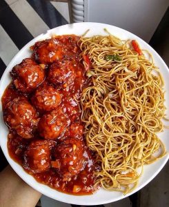
China Garden’s unbelievable success shook loose a daisy chain of copies serving a bacchanal of desi Chinese classics, all equally flippant with authenticity. These included bite-sized pieces of cauliflower, paneer or chicken plopped into gravies such as the giddy orange Schezwan (not Sichuan!) sauce, the self-explanatory Sweet and Sour sauce, the Chile Garlic sauce and the Hot Garlic sauce. The heat was muted by drifts of steamed or fried hakka noodles or fried rice.
“
Perhaps the true sign of Indian-Chinese food’s acceptance is that, today, India is carpeted with vendors crisply dispensing all sorts of delicious concoctions.
”
On the Sidewalk
Perhaps the true sign of Indian-Chinese food’s acceptance is that, today, India is carpeted with vendors crisply dispensing all sorts of delicious concoctions (after all, it is on the streets that innovation often quickens).
Behold! The spring dosa, with noodles and stir-fried ‘Chinese’ vegetables stuffed in its crispy folds, served with the obligatory coconut chutney and sambhar. The Chinese bhel, a tousle of deep-fried noodles stained orange, then buttressed with stripes of carrot, spring onion, cabbage and peppers and slapped with a spicy sauce — perfect for a little crackle, a little chew. The famous Triple Schezwan, a palimpsestic dish of fried rice, noodles and Schezwan-sauced vegetables. Although it is beloved across Mumbai, filaments of Kolkata can be seen here too — after all, Schezwan sauce might have been invented in Kolkata by the Huang family, owners of Eau Chew restaurant.
Side by side, another phenomenon occurred: the Chinese restaurant business slipped out of the hands of the Chinese-Indian community. Today, Punjabis own a big chunk of Chinese restaurants, and more Nepalis are chefs at Chinese restaurants than Chinese.
Across the Oceans
Naturally, Indian-Chinese food has also sailed across the oceans. The influx began in the early 1960s, during the Indo-China War when relations between the two countries curdled and many innocent Indian Chinese fled to China, the UK, the USA, and Australia. Today, eateries such as Moghul Express in New Jersey, NYC, Dragon House in NSW, Australia (run by a Hakka Chinese family from India), and London’s Bombay Chow all serve the classics, Hakka noodles, Fish Manchurian, Chile Chicken et al, although, in a bid to appeal to Western tastes, some of them have gentled the Indian spice levels. And so the cuisine completes its transformation — irreverent and shape-shifting but delicious as ever.
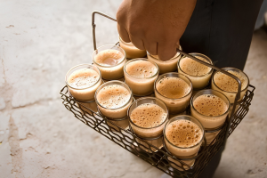
There is a particular kind of embarrassment that attaches to the chai stall in the Indian imagination. Not shame, exactly, but a sense that the stall belongs to a category of things that are real and indispensable and somehow not quite speakable in polite company. You stop there between appointments. You drink in a glass or a kullad, standing or squatting on a low stool, and you go. The exchange is quick by design, because nothing about the stall, no chair, no table, and no surface to rest a phone on, suggests you are welcome to occupy it longer than the tea takes to cool. People do linger, often. Politics gets argued there, gossip moves, a second round gets ordered. But the lingering happens despite the architecture, not because of it. Nobody designed the chai stall for your comfort. They designed it for your thirst.
India is often described as a tea culture. In one sense it plainly is. The country produces more tea than almost anywhere on earth, drinks it compulsively, and has built an entire informal economy around its distribution. The chai wallah at the railway platform, the office peon making rounds with a tray, and the gas burner going in the corner of every small shop are all a part of an infrastructure. But infrastructure is not the same as culture in the way the word gets used when people talk about coffeehouses. A culture implies a room. It implies you are allowed to stay.
America’s version of this story begins with an act of vandalism. In December 1773, colonists dressed as Mohawk people threw 342 chests of East India Company tea into Boston Harbour, making tea politically untenable almost overnight. John Adams, writing to his wife Abigail the following year, declared that tea “must be universally renounced” and that he had taken to drinking coffee every afternoon, bearing it, as he put it, “very well.” The tone of reluctant conversion is instructive. People did not suddenly prefer coffee. They decided, or were persuaded, that preferring it was the correct thing to do. Over the decade of the Revolution and through the Civil War, when Union supply lines made coffee far easier to distribute to soldiers than tea, the habit hardened into identity. By the time the war was over, coffee was simply what Americans drank.
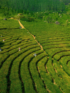
Aerial view of vibrant green tea plantations with workers in picturesque Munnar, India. / www.pexels.com
Coffee was no more native to America than tea was to India. It arrived through trade, became meaningful through politics, and was cemented by war and commerce. What made it American was accumulation, the stories told about it, the rooms built around it, and the version of the national self that became attached to the cup. The Boston Tea Party may not have made Americans love coffee, but it certainly made them decide that loving coffee was who they were.
What Americans then did with coffee is where the story gets interesting, because the drink itself was almost beside the point. The room it came with was the thing.
Sociologist Ray Oldenburg published a book in 1989 called The Great Good Place, in which he named what he called the “third place,” the informal social space that is neither home, which he called the first place, nor work, which he called the second. Third places are where democracy actually happens, where neighbors become neighbors rather than just people who share a street, where the social fabric gets woven in ordinary time. Coffeehouses qualify, and so do pubs, barbershops, and diners. What they share is accessibility, a tendency toward leveling rather than hierarchy, and conversation as the main activity.
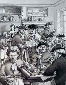
The coffeehouse had been doing this work long before Oldenburg named it. In seventeenth-century London, a penny bought you a cup of coffee and entry into a room where you could read the newspapers, conduct business, and argue about politics for as long as you liked. They were called “penny universities” because the information circulating inside them was otherwise unavailable to anyone without money or connections. The same model crossed the Atlantic and took root in the colonies, where the Green Dragon Tavern in Boston became known, without much irony, as the Headquarters of the Revolution.
16th cc English coffeehouse ( penny university) / in.pinterest.com
Tea generally occupied a different kind of social space. In England, tea came with a different set of social meanings, the drawing room and the fixed hour, the hostess and the tiered stand of sandwiches. It was domestic and feminized and, by all accounts, delicious, but it was not a space you could walk into off the street and stay until you had figured something out. In America, without even the drawing room tradition to fall back on, tea became a specialty, an occasion, a hotel amenity, something you ordered when you were under the weather or feeling wistful about somewhere else.
In India, meanwhile, tea was becoming something else entirely, and the mechanism of that transformation is fascinating precisely because it was not organic.
Tea cultivation in India began as a British colonial project in the 1820s and 1830s, when the East India Company identified Assam as a promising site for commercial tea cultivation and set about breaking China’s monopoly on global supply. For most of the nineteenth century, the tea being grown in India was being exported, largely to Britain. Domestic consumption remained limited for much of the nineteenth century. Across much of the subcontinent, people relied on a wide variety of regional drinks, including milk-based beverages, buttermilk, and water, while coffee had long-established traditions in the south that predated British arrival.
What changed this was advertising. The British-owned Indian Tea Association, anxious to create a domestic market for what was an enormous and growing supply, ran a campaign in the early twentieth century to introduce tea breaks into factories, textile mills, and mines. Chai wallahs were stationed at railway platforms. Tea was positioned not as a luxury but as a worker’s drink, cheap and energizing and available everywhere. The spices that transformed it into masala chai emerged through local adaptation, with vendors adding ingredients such as ginger, cardamom, cinnamon, and cloves according to regional taste.
in.pinterest.com
The result was a beverage that felt indigenous when it wasn’t, that felt ancient when it was barely a century old in its popular form, and that became genuinely social without ever quite becoming a salon. Chai, like coffee in America, accumulated its identity rather than inheriting it. Both drinks arrived from elsewhere, both got claimed as native, and both became social infrastructure. What they built with that infrastructure is where they diverged. America built rooms. India built a distribution network, and a very good one, but a network all the same.
The room finally arrived in India in 1996, and it did not serve chai.
Café Coffee Day opened its first outlet on Brigade Road in Bengaluru that year, founded by VG Siddhartha on coffee from his own estates, priced at twenty-five rupees a cup, with air conditioning and internet terminals and the implicit promise that you could sit there for two hours without anyone asking you to leave. It was aimed at a generation that had grown up watching liberalisation transform what Indian cities looked like and what they were for, and it succeeded almost immediately. Within two decades, CCD had more than 1,700 outlets across 243 cities. The tagline, “A lot can happen over coffee,” was less a description of the product than of the room. The coffee was incidental. What was being sold was the permission to occupy space without justification.
What Siddhartha understood, and what the chain’s early success confirmed, was that the third place India had never really built for chai, the room where you could stay without purpose, where time became social rather than productive, was a gap that a drink could fill only if the right architecture came with it. The drink signaled the room. The room was always the point.
This is the same logic, running in reverse, that explains what is now happening in America.
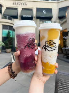
Heytea, which helped invent the premium milk tea category in China and now has roughly 4,000 stores there, opened three dozen American locations between 2023 and 2025, including a flagship in Times Square where lines have regularly stretched out the door for drinks topped with cheese foam. Chagee, another Chinese tea brand, listed on the Nasdaq in May 2025 and opened its first American stores in Los Angeles. Luckin Coffee, which has three outlets in China for every one Starbucks, opened several Manhattan locations. These companies are not coming to America because they believe Americans have been waiting for premium tea. They are coming because the Chinese food and beverage market has become, in the words of one industry investor, a condition of “severe oversupply,” with margins being ground down by a price war among hundreds of thousands of competing outlets. The United States offers better margins and room to breathe.
Heytea / in.pinterest.com
But the business rationale does not fully account for the cultural question, which is whether this wave of premium tea brands can do something that two hundred and fifty years of history have conspired to prevent, make tea a genuinely everyday social drink in America, not a niche or a novelty or an afternoon indulgence, but the thing you go somewhere specifically to drink with other people and you do it often, if not every day.
Tea enters a very different American market today than it did even a decade ago. Bubble tea, which originated in Taiwan in the 1980s and reached American cities through Asian immigrant communities before going mainstream with younger consumers in the 2010s, has done important preparatory work. It normalised the idea of paying café prices for a tea-based drink, of waiting in line for it, of treating it as an experience rather than a beverage. There are now more than 9,000 bubble tea shops in the United States, and surveys suggest that 94 percent of consumers in their twenties bought boba in a recent three-month period. That is not a niche. It is a category, and one that has already done the cultural labor of making tea something you seek out rather than something you settle for.
The Chinese chains arriving now are betting they can build on that foundation, offering something more refined, a drink you take seriously, and one that belongs to the same register as a pour-over or a natural wine. While Heytea brews loose-leaf tea rather than using powder or syrup, Chagee has positioned itself carefully as an “American-born Chinese” brand, hiring specifically for that cultural translation. Both understand, at least implicitly, that the drink alone will not be enough. You need the room.
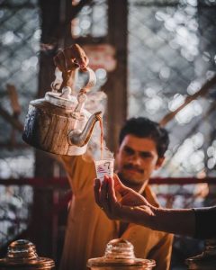
Chai tapri / in.pinterest.com
Its success will depend on something no amount of branding can manufacture, which is whether the third place these chains are trying to create feels like it belongs to the people inside it, or like a product being tested on them. Starbucks spent decades building that sense of belonging, and even then Oldenburg, who coined the term third place, declined when the company asked him to endorse their stores. The room, he seemed to be saying, has to mean something that cannot be franchised.
People adopt a drink when it comes attached to a world they want to inhabit, and they build that world when it represents a version of life they find worth performing. Coffee took root in America not because it tasted better than tea but because it became the drink of a certain kind of person, then a certain kind of citizen, then a certain kind of worker, and each time it shifted it brought the room with it. Chai became India’s drink because a colonial marketing apparatus decided it should be, and what Indians made of that imposition was something genuinely their own, warmth and community compressed into something fast, everything except the room.
What a café sells, whether it is CCD in Bengaluru in 1996 or Heytea in Times Square in 2024, is not the drink. It sells the hours inside it, the version of yourself you get to be while you’re sitting there, between the first place and the second, in the space that doesn’t ask you anything except what you’d like. The drink was never the point. It was always the excuse to build the room.
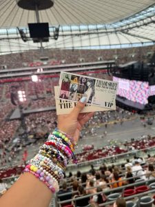
A Taylor Swift friendship bracelet costs almost nothing to make. A few inches of elastic and a handful of plastic beads, the kind of thing you might find in a school art room. It takes minutes to assemble and can be replaced for under a dollar. Yet, for thousands of fans, it becomes one of the most carefully kept objects they own, worn, traded, photographed, and preserved.
Its value has very little to do with the materials it is made from. It comes from what the bracelet represents, a concert, a community, a memory, or simply a relationship with an artist and her music. Once you notice that, you begin to see the same pattern elsewhere. People buy vinyl records they rarely play, carry tote bags advertising cafés they have already visited, hunt for limited-edition collectibles that spend their lives on shelves, and pay extra for special editions of books they already own in digital form.
The question is not why these objects exist. It is why they seem to matter more at a moment when so much of culture has become intangible.
The obvious explanation is identity. A cap or a tote or a tour hoodie is a social signal, a way of saying something about who you are and what you care about without saying it aloud. There is truth in this. Objects have always announced affiliation, university sweatshirts, football scarves, band T-shirts from the 1970s, none of this is new.
A Taylor Swift friendship bracelet / in.pinterest.com
What identity signalling does not explain is the timing. Merchandise has, in the last decade, escaped its traditional domains and become the default move for almost every kind of cultural producer, from stand-up comedians to independent coffee shops, from literary journals to software companies, from newsletters to museum gift shops that now account for a meaningful share of institutional revenue. People who already have access to the music are buying the vinyl. People who stream every episode are buying the cast’s branded candles. Something structural changed, and the identity argument, on its own, does not account for it.
To explain the timing, we have to start with what changed.
For most of the twentieth century, the relationship between culture and ownership was straightforward. If you wanted music, you bought it, a record, then a cassette, then a CD. If you wanted a film, you bought or rented it. If you wanted to read something, you bought the magazine or the book. Culture was scarce in a particular sense, access required a financial transaction that produced a physical object, and the object and the experience arrived together.
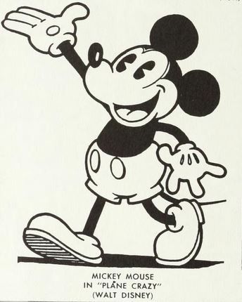
Merchandise existed alongside all of this, of course. Walt Disney began licensing Mickey Mouse’s image in 1929, and by the mid-1930s that licensing was generating hundreds of thousands of dollars annually. Rock bands have sold T-shirts since the 1970s. But merch operated at the edges of culture, an appendage to the main transaction. You bought the album, the T-shirt was optional.
Mickey Mouse (1929) / in.pinterest.com
Then, over roughly a decade beginning in the early 2010s, the relationship between culture and ownership began to reverse. Music moved to streaming, films and television moved to subscription services, journalism moved online and then into newsletters, video games shifted toward digital licenses and live service models, photographs moved to clouds, and even books acquired a second form that lived in a device, one the platform could alter or restrict under certain conditions.
Access became cheap and ownership became complicated, often without anyone quite noticing the shift. You do not own your Spotify library. If the service changes its terms or loses the licensing rights to something you love, it disappears. What you have is access, not possession. The relationship with culture became real but left no object behind.
Streaming is convenient, often affordable, and has genuinely expanded access to culture around the world. But it produced a vacuum alongside those gains. For the first time, non-ownership became the dominant mode of consuming culture rather than the exception. Radio and libraries had always offered access without possession, but they were the margins. Streaming became the default, and something moved in to fill the space that physical ownership had vacated.
The bracelet is a tangible anchor for a relationship with a song, a community, a version of yourself that stood in an arena and felt something. That matters, because plenty of people buy merch without attending events, without even a fixed memory to attach to the object. What they are buying is not a record of something that happened. It is evidence of something they belong to.
The consumer psychologist Russell Belk spent decades arguing that people experience their possessions as literal extensions of their identity, a theory he published in the Journal of Consumer Research in 1988 and the field has drawn on ever since. Kavita M., a counsellor who works with young adults, puts it more plainly, “Objects help us navigate social worlds and anchor feelings that would otherwise stay invisible.” A stream can carry enormous meaning and leave no trace in the physical world. An object carries that meaning outward, into a room,or onto a shelf, across a decade.
blue tokai tote bag / in.pinterest.com
Objects age in ways that streams do not. They can be touched and lost and found again. A scratched vinyl record carries history, a worn tour hoodie carries memory. This may also explain what initially seems like a paradox, vinyl sales have grown for eighteen consecutive years in the United States, reaching $1.4 billion in 2024, levels not seen since the mid-1980s, in an era when music has never been more accessible. The people buying records are not doing so primarily because the audio quality is superior, a claim that tends to be overstated. They are doing so because a record is something you can own. It exists in space, it can be shelved and retrieved and held. At a moment when the rest of your library is a column of text in an app, a record is the music made tangible.
The same logic runs through special editions of books in the Kindle era, through photocards and plushies in fandoms built on streaming platforms, through the café tote bag and the podcast mug and the newsletter’s branded notebook. The content is often free, or close to it. The object is the part you can keep.
What makes this moment different from earlier eras of merchandising is not that merch exists but that scarcity has moved.
In the twentieth century, scarcity lived in the media itself. A limited pressing of an album was rare, but the album was already a finite, physical thing. Today, producing and distributing a song costs almost nothing. Scarcity has been manufactured elsewhere, in tour merchandise available only at the venue on the night, in blind boxes where the figure inside is unknown until opened, in numbered editions, exclusive colourways, and drops announced with forty-eight hours’ notice and sold out within minutes. The mechanism is one luxury brands have used for decades, but it has migrated into categories that once had no pretension to exclusivity at all.
The Labubu makes this visible. A designer toy created by the Hong Kong artist Kasing Lung and sold by the Chinese company Pop Mart in blind boxes, it became one of the more improbable cultural objects of the mid-2020s, with some limited editions selling on secondary markets for several times their retail price. There are Labubu collectors in Delhi, Jakarta, São Paulo, and London. The toy is not licensed from a film or a band, and it is not a souvenir of any particular experience. Owning it is the experience. The object has become its own event. Merch began as the residue of an experience, and in some of its most contemporary forms, has become the experience itself.
Labubu / in.pinterest.com
In India, this shift has arrived with particular speed. For decades, the country’s merchandising ecosystem was largely confined to cricket and Bollywood licensing, categories with existing infrastructure and mass audiences. What has changed is who is in the business of selling objects. Prateek Kuhad releases vinyl, Blue Tokai sells canvas tote bags, Stand-up comedians sell tour hoodies, and independent creators launch stationery, journals, and apparel. This is not India catching up to something Western. It is India participating in the same structural shift, where audiences that once consumed culture and moved on are now looking for something to hold. The coffee is the content. The tote is the proof you were there.
This is why the most effective creator merchandise does not look like corporate merchandise. It does not push a logo. It encodes a reference, an in-joke, a lyric, or a specific moment, things that mean something only to people who were paying attention. The object functions as a credential, telling anyone who recognises it that you were in on this, and telling the person wearing it something more private. It tells them that this mattered enough to keep.
It would be easy to read all of this as a story about loss, as though we owned our culture and then surrendered it to subscriptions, and the hoodies are compensation. That reading misses what is actually happening. People are not buying merch because they are grieving. They are buying it because they have become more deliberate about what they choose to possess. A library of CDs owned by someone who half-listened to most of them is not obviously a richer relationship with music than a Spotify account and one carefully chosen vinyl that means something real. What has changed is the selectivity, not the impulse to own.
We once bought culture itself because access required it. Now access is cheap and widely available, and what we choose to own is the object that stands in for a relationship, the thing that makes a fleeting experience tangible and a digital affiliation visible. The friendship bracelet is the only part of that night the fan can carry home and still have in ten years. That is what we are paying for. Not the song, but proof that it mattered to us.
Every few months, a startup announces that it is building for Bharat. The press release mentions tier 2 and tier 3 cities, the next billion users, and the untapped potential of non-English-speaking India. The deck has a slide with dots in Lucknow and Coimbatore and Bhubaneswar, and the intentions are often genuine. The product, when it eventually ships, works beautifully on an iPhone in Gurgaon.
Bharat, for those unfamiliar with the term, is shorthand for the India that exists beyond the country’s major metros, the roughly 886 million people who were active internet users as of 2024, of whom 55% live in rural areas and 72% come from outside the country’s largest cities. This is the majority of India’s internet population, and it is growing faster than the urban slice, with nearly all of it, about 98%, accessing the internet primarily in languages other than English.
Many of the products built for this population are designed by teams based in India’s major metros, whose assumptions about connectivity, language, and digital literacy do not always match those of the users they hope to reach.
www.pexels.com
That is the actual problem, and it sits upstream of every specific failure that gets catalogued in design postmortems. It is not primarily a translation problem, though bad translation is everywhere. It is not merely a localization problem either, though localization is frequently an afterthought. It is an imagination problem, and it is structural. The designers, product managers, and engineers building these apps were trained on frameworks developed in Silicon Valley, schooled in case studies from American and European companies, and are themselves fluent English speakers who live in Indian metros and use high-end smartphones on reliable 4G networks. They are not lazy or malicious, but simply unable to picture, with any precision, the person they are designing for, because nothing in their professional formation required them to.
“There was one app where ‘Order Now’ was translated as ‘Abhi Aadesh Do,’” says Shruti Yadav, a product designer working on agri-tech tools in Madhya Pradesh. “Nobody talks like that. People thought it was a scam.” The word aadesh carries the register of an official command, the kind issued in a courtroom or a military briefing, grammatically correct but socially absurd, the equivalent of an app asking an American user to unironically “Procure Item Forthwith,” when ordering a mug online. The error is in the assumption that translation is a technical operation rather than a cultural one, an assumption that was never examined because the people who made it had never needed to.
“
It is an imagination problem, and it is structural.
”
This pattern repeats across every layer of product design. A search bar assumes literacy, a cart icon assumes prior experience with e-commerce, log-in code verification assumes a reliable network and a phone number that receives texts promptly, and email-based signup assumes that the user has and regularly checks an email account. These are choices that made sense for a particular kind of user in a particular context, imported wholesale into products targeting people for whom none of those conditions reliably hold.
But occasionally a product gets it right. WhatsApp, which now has roughly 535 million users in India and functions as the country’s de facto communication infrastructure, did not achieve this by targeting India specifically. It achieved it by being designed around constraints that happened to match Indian realities, among them minimal data consumption, no email requirement, voice messaging as a first-class feature rather than an add-on, and an interface simple enough to work across generations. It fit the realities of Indian users without requiring those users to adapt to it.
Most Bharat-first products have not managed the same.
“You cannot rely on minimalist design,” says Ankit Mishra, co-founder of a regional news app focused on Uttar Pradesh and Bihar. “In English apps, fewer words and clean UI means credibility. But here, users want more context. They want to see faces, videos, and explanations. More importantly, they want to see people who look like them using the product.”
unsplash.com
The idea quickly shifts from a tech issue to a trust issue. And trust in a first-time digital user looks very different from trust in someone who has been using apps for a decade. For the latter, a clean interface signals competence, and for the former, it can signal emptiness, a space that has not bothered to explain itself.
The few companies that have genuinely cracked this have done so by treating the design constraints of non-metro India not as obstacles to work around but as the actual brief. Meesho, which now serves 213 million users with 87% of them from outside India’s eight largest cities, built its early product around the fact that its users were already conducting commerce through WhatsApp and Facebook groups, and that the trust required to complete a transaction came from personal relationships rather than polished interfaces. It did not try to teach its users to behave like e-commerce consumers. It met them where they already were. Kuku FM and ShareChat made similar calculations about content, with regional languages and voice-forward interfaces designed for intermittent connectivity and shared devices.
Changing that starting assumption requires changing who is in the room when the assumptions are made. A product team staffed entirely by urban, English-educated designers working from a Bengaluru office is going to reproduce, even with the best intentions, the imaginative limits of that room. Field research and user interviews help, but there is a difference between visiting a user and being accountable to one, and most product teams in India are accountable upward, to investors and metrics, rather than outward, to the people the product is supposed to serve.
The market for Bharat is already here. The harder task is designing as though the default user is the person holding the phone, not the person building the app.
Think about the last time you imagined a city of the future. There were probably towers, glass and steel, screens embedded in surfaces, a sky interrupted by elevated transit, and neon bleeding into wet pavement at night. The scale was vertical. The palette was dark or cold or both. Almost certainly, it did not look like anywhere you actually live.
One way to understand this convergence is through what the psychologist Joseph Henrich calls prestige-biased cultural learning, the human tendency to copy the behaviors and styles of people and institutions that appear successful rather than evaluating each choice from first principles. “At an individual level, this is efficient,” says Kavita M, a Delhi-based counsellor who studies cultural psychology. “At a cultural scale, it produces convergence.” Countries and industries imitate perceived leaders, and over time those borrowed choices begin to reinforce one another.
“That is why financial districts around the world feature broadly similar towers, and why the visual language of economic power has become so standardized that you can often identify a building’s function before you can identify its country,” says Anurag T, a Delhi-based architect. Science fiction, in this reading, simply extrapolates that convergence to its imagined endpoint, mistaking a historical tendency for an inevitability.
Architecture has always been one of the clearest ways that power makes itself legible. The historian Thomas Metcalfe, writing about the British Raj, observed that the public buildings erected under colonial rule were charged with the explicit purpose of representing empire itself. The architecture was intended to make imperial authority visible and durable, turning the built environment into a statement of political power.
Similar dynamics appeared elsewhere, where centralized authority used architecture to project legitimacy and permanence. Science fiction inherited this association almost without noticing. When a story needs to depict an all-powerful state or corporation, it reaches instinctively for visual sameness, rows of identical towers, anonymous crowds, reflective surfaces that express nothing beyond scale. The dystopia looks the way it does because audiences have learned, through long familiarity with how power presents itself, to read visual uniformity as control.
That reading has a specific cinematic genealogy. In 1982, Ridley Scott’s Blade Runner drew its visual grammar from Hong Kong’s neon-lit commercial districts, Fritz Lang’s 1927 Metropolis, and the work of Syd Mead, the film’s credited visual futurist, who described his approach as layering new technology onto the accumulated wear of a city that could no longer afford to replace itself.
Fritz Lang’s 1927 Metropolis / in.pinterest.com
The film failed at the box office and became one of the most influential things ever put on screen. William Gibson, whose novel Neuromancer would help define the cyberpunk genre the following year, toldThe Paris Review in 2011 that he had avoided watching Blade Runner in theaters because he feared it would be better than what he had imagined. It was, he said, and even the first few minutes were better.
In one important sense, Blade Runner did more than imagine a future. It gave other filmmakers a visual language they no longer had to build from scratch. By 1988, Katsuhiro Otomo’s Akira had extended that language into anime, building Neo-Tokyo from neon and rubble and towers so tall they required a thousand floors to feel proportionate to the dread the story needed. Ghost in the Shell followed in 1995, its director Mamoru Oshii drawing on Hong Kong’s layered urban landscape to imagine a city where the past and the technological future occupied the same streets simultaneously. By the time The Matrix arrived in 1999, the grammar was so established that it functioned as shorthand, legible without explanation to audiences who had absorbed it across two decades of film without necessarily knowing they had.
The images became the genre, and the genre became, for many people, the template for what the future was supposed to look like. Which is why what Hannah Beachler did for Black Panther in 2018 registers as more than a production design achievement.
BLACK PANTHER 2018 / in.pinterest.com
Beachler spent eight months traveling across sub-Saharan Africa before she began designing Wakanda. She compiled a 515-page document she called the Wakanda Bible, detailing the architecture, topography, textiles, languages, and cultural logic of a fictional African nation that had never been colonized and had therefore developed entirely on its own terms. What she was practicing, deliberately and with considerable research behind it, was Afrofuturism, a movement that asks what African and diasporic cultures would have built, imagined, and become in the absence of the history that was actually imposed on them. The result was a future city that looked genuinely unlike most previously imagined ones, curved rather than angular, warm in its materials, drawing on rondavel rooflines, Zaha Hadid‘s fluid structures, and textile traditions from across the continent.
Audiences responded with something that looked as much like relief as admiration. Beachler became the first African American to win the Academy Award for Best Production Design. The question worth asking is whether that response pointed to something the dominance of the cyberpunk aesthetic tends to obscure. The generic sci-fi city is not a reflection of universal human intuitions about what progress looks like. That is difficult to square with the diversity of ways in which different cultures have imagined technology, cities, and social life. Instead, it reflects which stories got made, by whom, with whose resources, and whose existing imagery they drew from.
It became the default because those particular films were seen everywhere and their influence compounded, not because they captured something true about where all of us are headed. When we imagine the future, we imagine it from somewhere. That somewhere shapes everything, from the scale of the buildings and the logic of the streets to whether density reads as vitality or danger, whether ornament signals care or excess, and whether the future feels like it belongs to everyone. We have simply mistaken one visual language for the future itself.
Walk into a bank in New York, a venture capital office in Bengaluru, an Apple Store in Shanghai, or a luxury skincare boutique in Paris and you will notice something curious. Many of the world’s most powerful institutions now look uncannily alike.
The colors are restrained, the logos are simple, there is space between objects, and almost nothing appears accidental. That convergence matters for more than aesthetic reasons. As AI tools increasingly generate the websites, interfaces, and brand identities we encounter every day, they are also learning what authority is supposed to look like, and reproducing those assumptions at scale.
It would be easy to read this as convergence on good design. It is more interesting to ask how one particular visual language came to feel like the obvious choice in places with very different histories and aesthetic traditions.
The story does not begin with any single person or manifesto. In the early twentieth century, European architects and designers began arguing, with real conviction, that ornament was wasteful, that simplicity was honest, and that form should follow function. That argument took institutional shape in the Bauhaus in Germany, in the clean geometry of Swiss typography, and in the postwar corporate design of American companies that needed their identities to travel across borders without losing legibility. As these ideas moved into advertising, technology, publishing, and retail, they gradually stopped looking like ideas at all.
Swiss Style began in Switzerland during the 1940s and 1950s. / in.pinterest.com
A style had become so widespread that it no longer appeared to be a style.
Once that happened, everything else acquired a kind of unearned baggage. A dense page came to seem confusing rather than rich, decoration began to imply excess rather than care, and bright colors read as unserious. Ornate typography suggested nostalgia or kitsch. None of those associations are inherent to the things themselves. They accumulated through a particular history, in particular places, and then traveled further than the history did.
You can feel the distance between traditions most clearly when you look at visual cultures that developed along different lines.
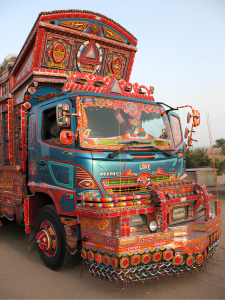
In the truck art of Pakistan and northern India, surfaces invite prolonged attention, layered with floral borders, Urdu calligraphy, mirrored panels, and painted birds. The gopuram towers of Madurai’s Meenakshi Amman Temple rise above the city with thousands of sculpted figures across their facades, encouraging repeated viewing rather than instant comprehension. Across much of South Asia, a wedding invitation that arrives without layering, gilding, and detail often reads not as elegant but as indifferent, as though the occasion did not merit the effort. In these traditions, visual abundance is often not a sign of disorder. It can communicate care, celebration, craftsmanship, or social importance.
Truck art from Pakistan / in.pinterest.com
The point is not that one tradition is more sophisticated than another. It is that what reads as sophisticated depends on what you have been trained to read, and most of us absorb those trainings so early and so completely that they feel like perception rather than preference.
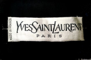
Brands have understood this instinct, even without naming it. During the 2010s, some of the most recognizable names in luxury fashion abandoned their distinctive heritage lettering for nearly identical clean sans serif wordmarks. Saint Laurent dropped the founder’s curved script in 2012, Balenciaga followed in 2017, Burberry in 2018, with Balmain and Celine close behind. The redesigns were defended as cleaner and more contemporary, better suited to digital screens. What attracted less commentary was that genuinely different houses, each with a distinct history and country of origin, had come to look surprisingly similar. One industry publication called it “blanding.” A few years later, Burberry reinstated its equestrian knight and Saint Laurent brought back the Cassandre monogram first designed in 1961. The reversal suggested that distinctiveness still had value.
The forces pushing in the opposite direction, however, have only grown stronger.
AI design tools can now generate interfaces, logos, landing pages, and brand systems in seconds. Their outputs often converge on familiar patterns, generous white space, restrained typography, muted palettes, and similar button styles. One frequently cited example comes from Tailwind CSS, whose creator chose indigo as the framework’s default accent color because it looked polished and professional. That decision influenced countless developers and templates and has since become emblematic of how quickly design defaults can spread across the web.
in.pinterest.com
Researchers and designers have increasingly warned that these systems can reinforce existing conventions rather than expand them. When models are trained on large collections of contemporary websites and branding, they are likely to reproduce the patterns that already dominate those datasets. The risk is a feedback loop in which familiar aesthetics become even more dominant.
Consumers respond to these signals in ways that tend to run beneath conscious awareness. Researchers studying what psychologists call processing fluency, the ease with which the brain handles visual information, have found that simpler and more legible presentations can produce a sense of cognitive ease that people then associate with trustworthiness and quality. We do not only read design. We tend to infer credibility from it before engaging with the content itself.
Those impressions carry cultural assumptions that frequently go unexamined, and they are now being reinforced by tools capable of producing design at enormous scale.
Minimalism did not become dominant because everyone agreed it was the most beautiful way to design. It became dominant because it came to look like the absence of style, the visual equivalent of common sense. The difference now is that those assumptions are no longer transmitted only by schools, brands, or institutions. They are increasingly embedded in the software that helps design the next generation of interfaces, logos, and websites, making one cultural preference feel ever more universal.
Open your front camera. Pick a filter. You still look like yourself, just smoother, sharper, lighter. You didn’t ask for an upgrade, but the algorithm gave you one anyway.
Face filters seem harmless, right up until you examine what they’re doing, and who they’re built for. Behind each digital ‘enhancement’ is a machine learning model trained on data that largely skews to a Western model. When these models are applied to South Asian faces, they automatically lighten skin, narrow noses and straighten jaws.
Platforms such as Instagram and Snapchat rely on facial recognition tools developed primarily in the West. In one study from MIT Media Lab, facial analysis algorithms had an error rate of just 0.8% for light-skinned men, but up to 34.7% for dark-skinned women. That’s not just about identification. It also signals who the system sees clearly and who it reshapes.
The effect isn’t always obvious. Many Instagram filters don’t announce themselves because they’re baked into the default camera settings. A light blur here, some auto-slimming there; you post the selfie because the camera automatically makes you look good.
“
In one study from MIT Media Lab, facial analysis algorithms had an error rate of just 0.8% for light-skinned men, but up to 34.7% for dark-skinned women.
”
Globally, over 1.5 billion people use augmented reality filters every day. In India, with its 200+ million Instagram users, the numbers aren’t broken out — but scroll for five minutes and you’ll see it. A filter-fed aesthetic is slowly becoming the norm. Eventually, unfiltered faces start to feel almost unnatural.
India already had a complicated relationship with beauty. Caste, class, and colourism have long defined desirability. What filters do is scale those ideas. Preferences become presets. Bias becomes baseline.
www.pexels.com
You could argue this isn’t new. After all, fairness creams and nose jobs have been telling us what to fix for decades. But tech makes it frictionless. You don’t have to choose change anymore. The camera does it for you.
When Snapchat launched its ‘beauty’ lens in 2020, users across Asia pointed out how it lightened skin and Europeanized features. Tiktok installed on South Korean and Japanese phones automatically whitened users’ skin, gave them smaller faces and plumped up their lips.Some have pointed out that their Japanese TikTok, when used with a Japanese SIM, wouldn’t let them record anything without a beauty filter. The app’s “Bold Glamour” filter uses AI so precise it doesn’t glitch when you move your face or dance around the room. It works so well that it doesn’t feel like a filter any more, it feels like a suggestion.
“
When Snapchat launched its ‘beauty’ lens in 2020, users across Asia pointed out how it lightened skin and Europeanized features.
”
India’s creator economy is responding. Filter makers are designing AR effects that lean into regional features, brown skin tones, and desi humour. But platform discovery still rewards what’s already working. And what’s working is what fits global defaults.
If beauty is becoming a tech product, we have to ask: who’s writing the code? Who trained the model? How many Indian faces were in the dataset?
The face in the mirror is yours. The one on the screen might be the platform’s version of you. The real question is, will we keep editing ourselves until we match it?