In Gregory David Roberts’s Shantaram, the relationship between Lindsay Ford and his local guide, Prabaker, is a way of understanding the everyday Indian practice of jugaad. Lindsay arrives in Bombay (present day Mumbai) using a false passport, intending the city to be merely a stopover on his journey from New Zealand to Germany. However, he decides to hire Prabaker to get around the city. Their relationship quickly develops into a friendship, with Prabaker affectionately renaming him “Linbaba” and later taking him to his native village, Sunder. Yet Prabaker’s importance extends beyond companionship: he represents the invaluable acquaintance who knows how to make things happen. He understands the city, speaks its social language and can connect Lindsay to the people, places and resources that would otherwise remain inaccessible to an outsider. In this sense, Prabaker embodies the familiar assurance, “I know a guy.” The phrase captures one dimension of jugaad: the ability to solve problems by drawing upon informal networks of friends, relatives, neighbours and acquaintances.
Imagine attempting to travel across India entirely on your own, as someone who is visiting for the first time. You book your hotels online, you look at locations on Google Maps, compare prices on travel websites and plan a meticulous itinerary. On paper, the journey appears quite manageable. Yet the moment you step outside the predictable world of airports, hotel chains and app-based taxi rides, another face of India starts to unravel. This is the India that cannot always be navigated through a screen. When formal systems are slow, expensive or difficult to navigate, knowing someone who can identify the correct person, arrange an introduction or find an unconventional solution turns into a form of social capital.
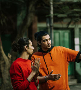
Such an acquaintance does not necessarily possess official authority; their usefulness comes from knowing whom to approach and how the system actually functions. Prabaker, in Shantaram plays this role for Lindsay. He makes an overwhelming and unfamiliar metropolis navigable through his knowledge of its people and more importantly, unwritten rules. Jugaad, in a way, describes a method of getting things done, in which human connections compensate for limited access.
The phrase “I know a guy” is often used jokingly, but it underscores and reveals something fundamental about how India functions. The “guy” in question may be a driver who knows a mechanic, a tour guide who speaks three regional languages(or maybe even foreign languages such as Mandarin or Spanish), or a hotel employee whose cousin can arrange a last-minute journey to a remote village. Such people serve as bridges between formal systems and the vast informal economy that surrounds them.
Jugaad is now widely acknowledged as a distinctly South Asian concept (with its own Wikipedia article), even if similar practices exist in other parts of the world. Derived from Hindi and also used in Urdu and Punjabi, the term describes the ingenuity needed in order to solve a problem with limited resources, often through improvisation, the use of personal contacts and unconventional arrangements. It can refer to anything from a makeshift repair to an affordable transport solution, but it also captures the social resourcefulness behind the phrase “I know a guy.” In recent years, jugaad has acquired meanings beyond everyday speech and entered global discussions of management and “frugal innovation.” Yet within South Asia, it remains as an abstract business philosophy rather than a practical method of navigating daily life.
India’s informal economy includes millions of workers and businesses operating outside (or partly outside) the structures associated with registered companies, fixed salaries, standardized contracts and prices that have been clearly advertised. Street vendors, domestic workers, small repair shops, guides, porters, drivers, craftspeople and countless family-run businesses make up this realm. Yet their work does not lie in the peripheries of Indian life; it is found at its very core.
In a shopping mall, every product carries a maximum retail price. But when one goes to a street market, the price may emerge only through a conversation with the vendors. After a brutal round of bargaining, the final amount asked of the customer might be dependent on the time of day, the quantity purchased, the buyer’s familiarity with local prices and, sometimes, their command of the language. Is the quoted price reasonable? Would bargaining be expected or insulting? How low is too low? This is where local knowledge becomes valuable. The guy that one knows, knows when a price is negotiable, when it is already fair and when a customer is being charged an exaggerated “tourist rate.”
India has hundreds of languages and dialects, and even widely spoken languages change noticeably across regions. A person may know some formal ways of speaking Hindi and still struggle with a rapid conversation in a local market. Someone fluent in English may easily book a room in a city hotel but encounter difficulty whilst arranging for transportation in more unfamiliar terrain. India’s major routes and cities can be navigated through flights, trains and app-based cabs. However, reaching smaller towns or villages may require informal arrangements with local people. This includes a shared taxi with unknown strangers if one has to cut down on costs, an auto-rickshaw driver that has been recommended by a shopkeeper, or a private vehicle. The system can appear chaotic to an outsider, yet it often operates through dense networks of trust and reputation.
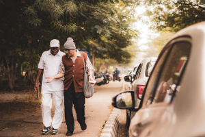
One might argue that information is available online, but the most useful information might not be displayed there. A local driver would possess the knowledge of certain roads becoming unusable during the monsoon season, and a local fisherman would know when boats can safely cross a particular stretch of water. Their knowledge is rooted in their lived experiences, but is also frequently undervalued because it is not presented through an official institution.
The phrase “I know a guy” therefore, describes a networked society in which people rely on acquaintances to overcome uncertainty, and minimize risks. The “guy” possesses what might be termed as navigational capital: the ability to connect people, negotiate arrangements and make systems intelligible. To travel through India is to discover that the country does not run only through official institutions. It also runs through conversations, recommendations, introductions and small acts of mediation: all of which makes a person resourceful or jugaadu. A journey becomes easier when someone knows the language, understands the local rhythm and can identify the right person to call. One may begin with a detailed itinerary. But somewhere along the way, the map will fail, the advertised price will become negotiable, and the bus you expected will not arrive. Then someone will smile, take out their phone and say the sentence that keeps much of India moving: “Don’t worry. I know a guy.” That is what jugaad looks like.