

Walk into a bank in New York, a venture capital office in Bengaluru, an Apple Store in Shanghai, or a luxury skincare boutique in Paris and you will notice something curious. Many of the world’s most powerful institutions now look uncannily alike.
The colors are restrained, the logos are simple, there is space between objects, and almost nothing appears accidental. That convergence matters for more than aesthetic reasons. As AI tools increasingly generate the websites, interfaces, and brand identities we encounter every day, they are also learning what authority is supposed to look like, and reproducing those assumptions at scale.
It would be easy to read this as convergence on good design. It is more interesting to ask how one particular visual language came to feel like the obvious choice in places with very different histories and aesthetic traditions.
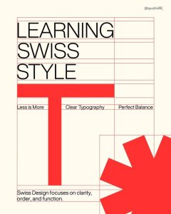
The story does not begin with any single person or manifesto. In the early twentieth century, European architects and designers began arguing, with real conviction, that ornament was wasteful, that simplicity was honest, and that form should follow function. That argument took institutional shape in the Bauhaus in Germany, in the clean geometry of Swiss typography, and in the postwar corporate design of American companies that needed their identities to travel across borders without losing legibility. As these ideas moved into advertising, technology, publishing, and retail, they gradually stopped looking like ideas at all.
A style had become so widespread that it no longer appeared to be a style.
Once that happened, everything else acquired a kind of unearned baggage. A dense page came to seem confusing rather than rich, decoration began to imply excess rather than care, and bright colors read as unserious. Ornate typography suggested nostalgia or kitsch. None of those associations are inherent to the things themselves. They accumulated through a particular history, in particular places, and then traveled further than the history did.
You can feel the distance between traditions most clearly when you look at visual cultures that developed along different lines.
In the truck art of Pakistan and northern India, surfaces invite prolonged attention, layered with floral borders, Urdu calligraphy, mirrored panels, and painted birds. The gopuram towers of Madurai’s Meenakshi Amman Temple rise above the city with thousands of sculpted figures across their facades, encouraging repeated viewing rather than instant comprehension. Across much of South Asia, a wedding invitation that arrives without layering, gilding, and detail often reads not as elegant but as indifferent, as though the occasion did not merit the effort. In these traditions, visual abundance is often not a sign of disorder. It can communicate care, celebration, craftsmanship, or social importance.

The point is not that one tradition is more sophisticated than another. It is that what reads as sophisticated depends on what you have been trained to read, and most of us absorb those trainings so early and so completely that they feel like perception rather than preference.
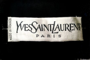
Brands have understood this instinct, even without naming it. During the 2010s, some of the most recognizable names in luxury fashion abandoned their distinctive heritage lettering for nearly identical clean sans serif wordmarks. Saint Laurent dropped the founder’s curved script in 2012, Balenciaga followed in 2017, Burberry in 2018, with Balmain and Celine close behind. The redesigns were defended as cleaner and more contemporary, better suited to digital screens. What attracted less commentary was that genuinely different houses, each with a distinct history and country of origin, had come to look surprisingly similar. One industry publication called it “blanding.” A few years later, Burberry reinstated its equestrian knight and Saint Laurent brought back the Cassandre monogram first designed in 1961. The reversal suggested that distinctiveness still had value.
The forces pushing in the opposite direction, however, have only grown stronger.
AI design tools can now generate interfaces, logos, landing pages, and brand systems in seconds. Their outputs often converge on familiar patterns, generous white space, restrained typography, muted palettes, and similar button styles. One frequently cited example comes from Tailwind CSS, whose creator chose indigo as the framework’s default accent color because it looked polished and professional. That decision influenced countless developers and templates and has since become emblematic of how quickly design defaults can spread across the web.
Researchers and designers have increasingly warned that these systems can reinforce existing conventions rather than expand them. When models are trained on large collections of contemporary websites and branding, they are likely to reproduce the patterns that already dominate those datasets. The risk is a feedback loop in which familiar aesthetics become even more dominant.
Consumers respond to these signals in ways that tend to run beneath conscious awareness. Researchers studying what psychologists call processing fluency, the ease with which the brain handles visual information, have found that simpler and more legible presentations can produce a sense of cognitive ease that people then associate with trustworthiness and quality. We do not only read design. We tend to infer credibility from it before engaging with the content itself.
Those impressions carry cultural assumptions that frequently go unexamined, and they are now being reinforced by tools capable of producing design at enormous scale.
Minimalism did not become dominant because everyone agreed it was the most beautiful way to design. It became dominant because it came to look like the absence of style, the visual equivalent of common sense. The difference now is that those assumptions are no longer transmitted only by schools, brands, or institutions. They are increasingly embedded in the software that helps design the next generation of interfaces, logos, and websites, making one cultural preference feel ever more universal.




Leave a Reply