

We’ve all grown up with the distinctive memory of the vivid illustrations that adorned our favorite books. They were too heavy for us to carry around at the time, yet we clung to their pages in hopes that we too could be whisked away to distant, imagined lands. From the iconic dust jackets of Amar Chitra Katha and The God of Small Things, we learned to recognize books simply from their emblematic art. What if we told you that book covers, like art, have gone through their own phases of modernism, maximalism and cultural renaissance? And what if we told you that India is the perfect case study?
Indian art is inseparable from its loudness. In a country of many languages, cultures and histories, maximalism seems inherent to the way Indians live, seeping into every crevice of artistic expression. In search of the holy grail of contemporary Indian book design, one must look back to the origins of writing and bookbinding in the country, which evolved from stone tablets to palm leaves between the 11th and 14th centuries. The Mughal era brought Persian influences, further diversifying the intricate art of design – from the brass block designs of Rajasthan to the Banaganapalli lacquer work of Southern India. Paper and modern printing were introduced in India from the 15th century onwards, a byproduct of proselytization by Christian missionaries.
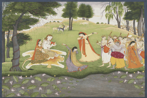
From Madhubani and Tanjore to Pattachitra and Thangka art, Indian book covers draw on their own history and enmesh it with Western art forms, creating a syncretism of sorts. These influences are captivating: the push and pull of modern realism set against the vibrancy that Indian writing and experience demand. An example that immediately comes to mind is the Mughal miniature on the cover of Amartya Sen’s The Argumentative Indian, a split cover with a white base and plain red text. A book recording eccentric moments from Indian culture and history calls for a look into that history, but not without Western script that would appeal to the target audience.
Most importantly, Indian design is birthed from the story being told. Tales of deep domestic scars and historical resistance come with covers that may not be explicitly visually stimulating, but their restraint speaks volumes. Take, for instance, Tahmima Anam’s The Good Muslim. The muted, papyrus-toned background and understated typography recede, leaving the image of a half-burnt book to dominate: dusty, charred pages that evoke the brutality of war.
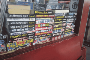
Perhaps the most interesting period of Indian book cover art is that of Indian pulp fiction. Identifiable by gauche horror fiction and blood-curdling murder mysteries, with just a touch of exaggerated sex appeal and grandiose dialogue, pulp fiction art was the bread and butter of the 1970s and 1980s. With its literary base in Meerut, Uttar Pradesh, pulp fiction covers were electrifying, provocative and arresting. One of the great artists of this time, Shelle, is praised by Amit Khan, a prominent pulp fiction writer: “…if he’s making fingers or hair, they were amazingly detailed illustrations, incomparable to even photographs.” Other popular artists of the time included Mohan Manimala, Suresh and Anil Pathak, who would spend hours on their detailed sketches.
Hand-painted and meant for the populace, pulp fiction became popular at a time when mass-produced paperbacks were taking India by storm. People wanted covers that excited them, ones that helped the masses escape their regular realities into worlds of riveting fiction. Accessible to a majority of the Indian public, these books found their primary audience among the blue-collar workers of India – coolies, rickshaw drivers, vegetable hawkers, street food vendors – those who wanted something quick, legible and stimulating, in languages they could easily understand. Closely following were female audiences, for whom these books served as a connection to the world outside their homes. “Girls used to be the important character of the illustration for any pulp novel,” says Pathak.
Critic Mrinal Pande links the appeal to the real-life experiences of its key readership: “There’s a lot of violence in small-town India, with kidnappings and killings, and so they can relate to the plots – only they want a hero going against the system who wins.”
On the other end of the spectrum came Satyajit Ray’s modernist design principles. Starting out as a junior visualizer at the advertising firm D. J. Keymer and Co. and going on to become principal artist at its sister publisher, Signet Press, he incorporated traditional Bengali Alpona and Patachitra art with Western influences, among many other genre-bending stylistic choices. In books such as Aamabasya and Bonolota Sen, he pays homage to Rabindranath Tagore’s paintings in his depictions of the female form, using negative space and asymmetrical titling to break away from the traditional Bengali book covers that permeated the space in the early 1950s.
India’s art scene bounced in and around the socio-political turmoil of the times. The Bengal famine, the Partition and the struggle for independence brought literature more rooted in realism, portraying local challenges and leaping away from art that appealed only to the urban spaces. Zainul Abedin, an artist from Bangladesh, is recognizable through his work with negative space. Background features are flattened and minimal to give focus to the subject, evoking emotion and representing the despair of the time. This emphasis is also seen in Ray’s work, integrated with his own individuality through realism.
Unfortunately, hand-painted and drawn illustrations are in decline – largely owing to e-books, AI, and graphic artists working on computers. Shagun Sharma, one of Meerut’s biggest pulp fiction publishers, speaks to this change: “The era of computer and technology came up with its repercussions…We have some stock paintings, and now instead of asking an artist to draw a cover for us, we take our old stock images and merge them with pictures available on the Internet.” There is a growing priority on marketing and salability over creative direction, compounded by the increased quantity of books published. This boosts demand faster than illustrators can keep up, leading to the recycling of older artwork.
Even so, it is by no means “out with the old”; we are also “in with the new,” with a wave of Indian artists producing beautifully intricate and meaningful compositions that catch both our eyes and our hearts. Prominent names include Bhavi Mehta, who won the 2024 Oxford Bookstore Cover Prize for her design of Pradeep Sebastian’s The Book Beautiful, as well as Aarushi Menon and Antra K, both story-driven artists with innovative styles. Manimala and Suresh are still freelancing for publications, drawing on their old habits of sketching and combining them with digital design.
Further, many people are working to keep the old art alive. Author Quinn Dombrowski maintains an incredible archive of old South Asian book cover art through her visual blog on Flickr. Blaft Publications, co-founded in 2008 by American-born Rakesh Khanna, is a house that translates and publishes contemporary regional pulp fiction from India and abroad, keeping the genre alive and accessible to a whole new audience. Their work includes The Blaft Anthology of Tamil Pulp Fiction Vols. 1 and 2 and The Blaft Book of Anti-Caste SF, among others.
Thus, art persists. The next time you pick up a book, stop and look for a while. The depiction may be more captivating than the words themselves.




Leave a Reply